Inside
[pc-game-review 
Review Notes:
- Played on the Steam Deck
A Masterclass in Presentation
Recently I’ve been playing Hitman 3 and enjoying the hell out of it. The in-game experience is a masterclass in presentation. Hitman knows how to communicate the wide variety of variables a player needs to take in at any given moment while in the assassination sandbox. However, the out-of-gameplay experience leaves much to be desired. I already knew this before playing Inside, but what Inside did was simply emphasize the stark contrast in presentation styles. Now bear in mind I am attempting to compare apples and oranges with these two games, Hitman is always online and follows the “games as a service” model while Inside is more akin to a film in many ways. Suffice to say, the business model and gameplay for these games are very different. What I am going to compare is the out-of-gameplay experience as I’ve coined it just now. For Inside, you buy the game, click install, click play, and you arrive at the title card you see used at the top of this review. One tap of a key on your keyboard and the title fades and a child crawls out of the brush and now you’re in-game. This may seem so elementary, but it was such a breath of fresh air for me. Just this year I’ve played Dying Light, Doom Eternal, and Hitman 3 and all three suffer from what I’m going to call main menu vomit. Main menu vomit is when the first thing a game greets you with is pop-ups in each corner talking about subscriptions or season passes or seasonal content or unlockable aesthetics… belgh. Inside doesn’t even have a conventional main menu, every time you load it up it essentially unpauses. Now, Inside’s gameplay and structure is very conducive to this streamlining, but I appreciate it, nonetheless.
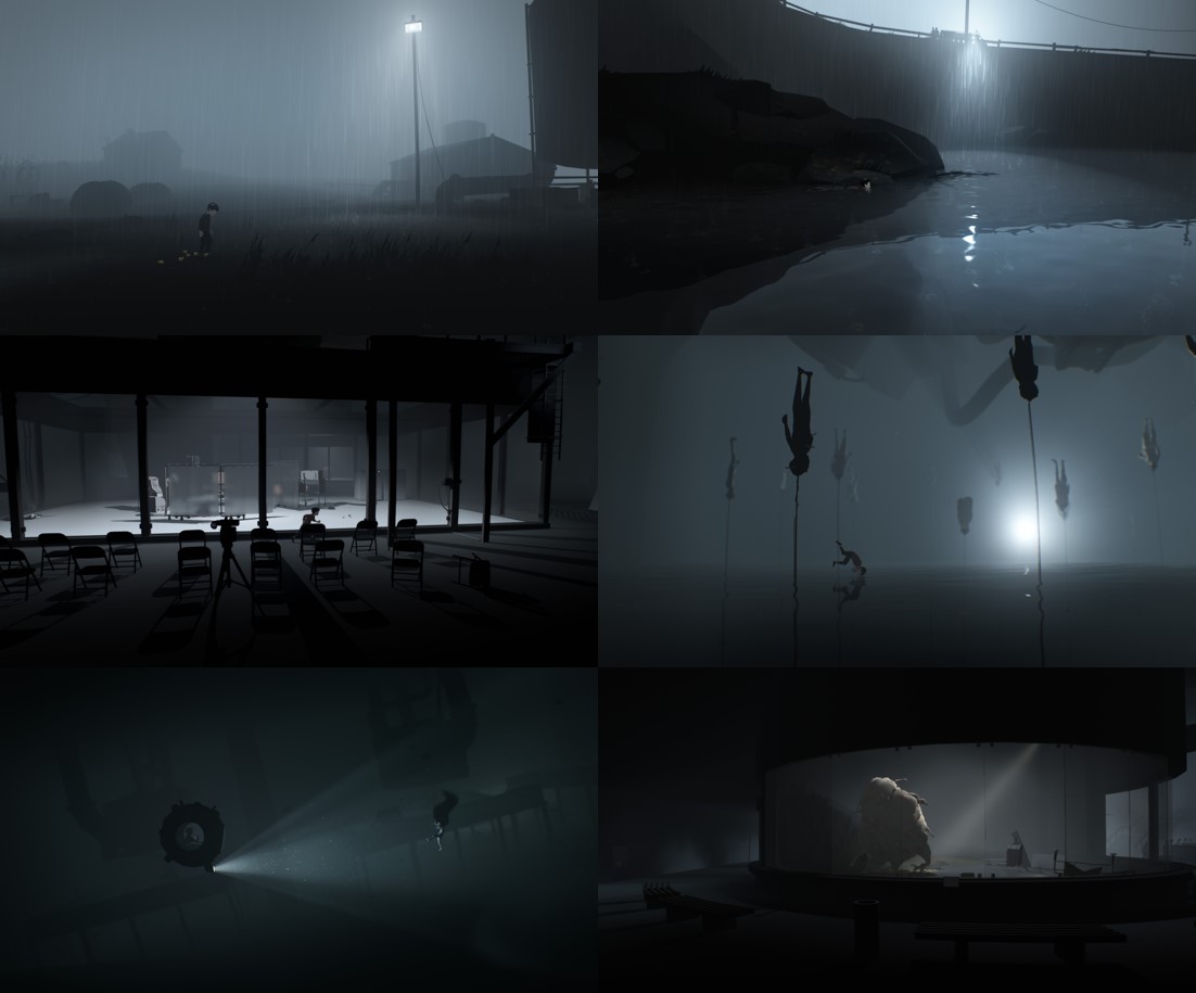
Moving on to the actual game, the quality in presentation is unwavering. There is zero UI, even for tutorials, keeping with an absolutely clean aesthetic. Since there’s only two inputs, movement and grabbing, the developers rely on the player to figure it out. The graphics are crisp, being detailed where needed but also large swathes of the screen being a single color. The use of color is very reserved and muted with most everything being in greyscale. This makes objects with even muted colors ‘pop’ in the environment. I think of the submarine with its dull, rusty yellow, the fleshy tan of the abomination, the warm hue of sunlight. I love the emphasis on the little things via detailed animation like footsteps through puddles, rain droplets on the surface of a pond, the cone of illumination casted by a floodlight, the characters hands pressed onto a windowpane as you peer out. The gameplay of Inside is so minimal and as someone who tends to drift off games that don’t have engaging gameplay these little things kept me in the world, wanting to walk through a puddle just because. The sample of screenshots below are just a taste and do not communicate what it’s like to move in and hear the sounds of this world. All I can say is that the quality only grows on you.
The Stream Crossing
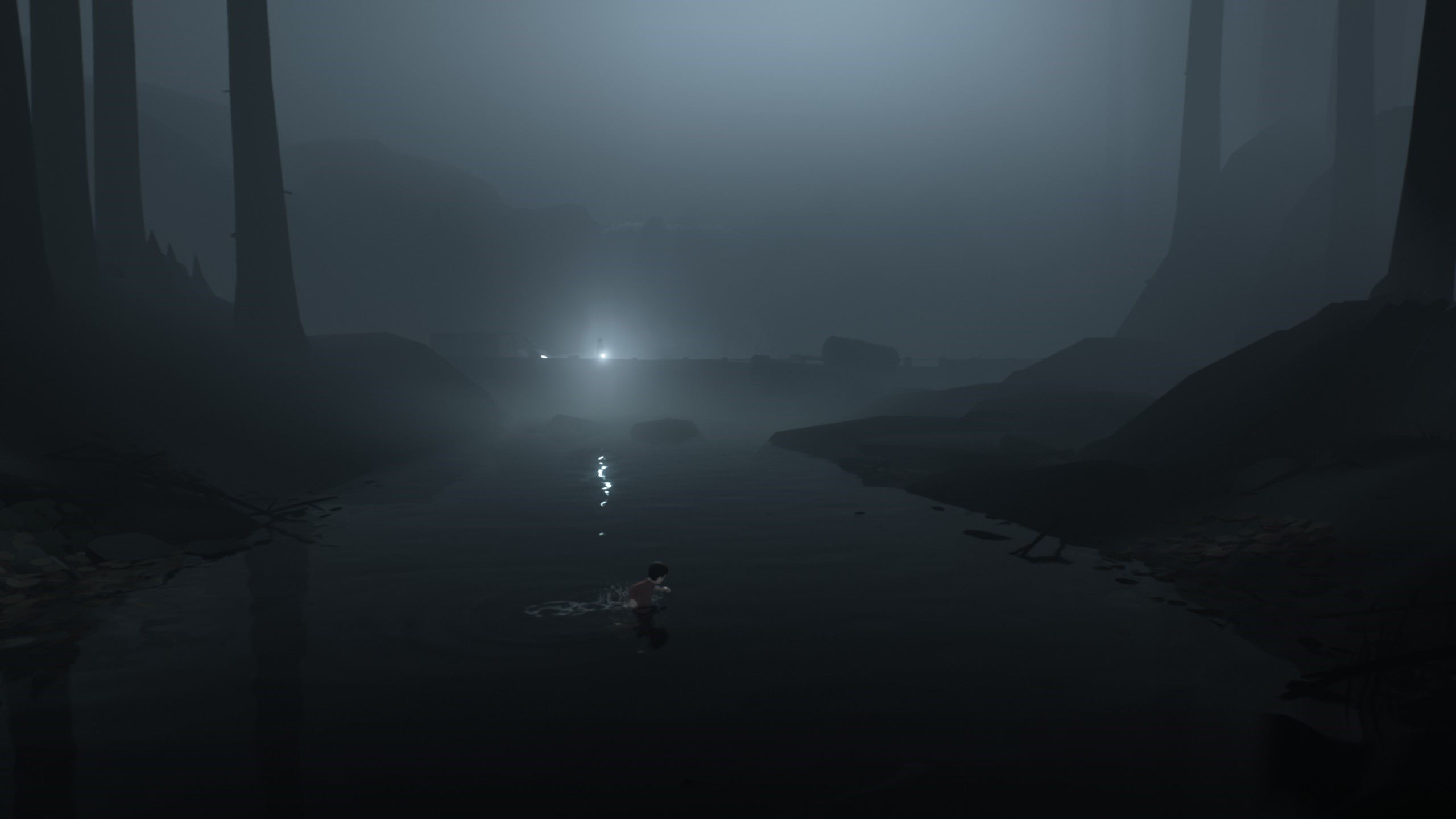
I want to take a closer look at one scene in particular to further illustrate some points. Take a look at the screenshot below, we’re at a moment where the child is in the middle of crossing a stream and a floodlight off in the distance suddenly focuses on him. It may be apparent, but it is important to note that there are no interactables on screen, therefore the player must only hold the right arrow key to proceed. So how do the developers of Inside make this scene interesting or engaging? To answer this question, we must take a slight step back. When the child first slid down into the creek, the camera followed along but it also zoomed out and panned slightly up. This camera action placed the bridge in the background in the middle of the screen with the man with the floodlight now centered. This also accentuated the height of the barren trees that frame the scene while growing the hazy gray backdrop. The collective effect is a sinking and shrinking feeling the player experience as the child’s stature and movement speed dwindle relative to the shot. The moment the floodlight focuses on the child you begin to hear dog barks. Your stomach drops. Then the cherry on top is as you see the dog ravenously charging, the stream gets deeper, the child sinks, now wading just above chest height, and his movement speed slows to a crawl as he pushes through the current. I think this example illustrates how the developers grow tension in the many vignettes dotted throughout Inside. Even with limited player interactivity they are able to curate a scenario that effectively builds and releases tension.
Verdict
★★★1/2
Inside exists in a realm somewhere between games and film. When Inside presents the player with obstacles it slows down and the feel is very gamey. Whether that’s because there’s trial and error involved, and you’re repeatedly dying or because there’s a puzzle that you must resolve before proceeding. None of this is bad just average. I think Inside’s strength is when it flows like a scene in a film that’s shot in a single take. The Sam Mendes’ film 1917 came to mind. Not because of the setting but because of this flow. The camera goes on a journey with the main character as he traverses battlefields, countrysides, cities, and more. There’s a momentum and energy that this technique evokes that can be found throughout Inside. With video games that energy can be even more tactile as you can really engage with the aforementioned little things. Brushing aside cornstalks, sliding down roofs, careening through office complexes shattering windows and upturning all furniture in your path… it’s never felt more engaging.